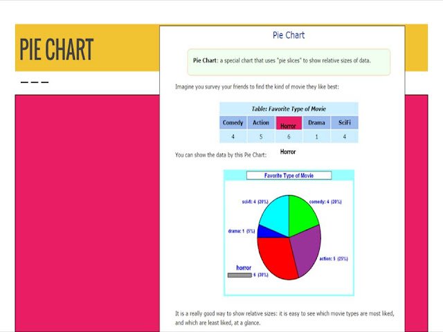
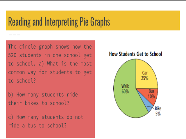
A circle graph shows how a category of data
compares to the whole. The circle is divided
into sectors. Each sector represents a
category. Each category represents a specific
percent of the whole. The area of the sector is
the same percent of the area of the circle.
Circle graphs are easier to use when there are not
too many categories. Too many sectors make a circle
graph difficult to read.
Circle graphs are easier to interpret when the
percents are easily distinguishable. If the percents
are too close in value, it is hard to see the differences
in the sections.
KEY IDEAS
*A circle graph shows how each category of data compares to the
whole using percents.
*The sum of all the percents in a circle graph is 100%.
*Circle graphs are easier to interpret when there are a small number of
categories and when the percent values are not too close together.


No comments :
Post a Comment